
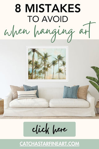
8 mistakes to avoid when hanging art
The art you choose can make or break the look and feel of your room. Take these common mistakes into account when planning your art to maximize the impact of your largest decorating space... your walls!
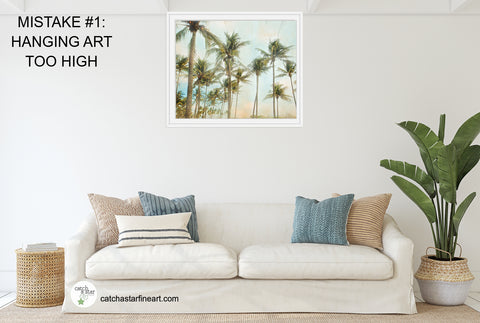
MISTAKE #1 - HANGING ART TOO HIGH
This is the most common mistake people make. It will look something like this:
Art should be hung at eye level. Subjective, right?, because human height varies quite a bit! But 'eye level' for art is considered to be placing the center of the image approximately 56" - 60" from the floor.
QUICK TIP: Having trouble? Measure 60" from the floor and make a small dot with a pencil. Measure halfway on your art and make a little dot on the back. Line up the dots to get approximately the right height. It doesn't have to be perfect!, but this will give you an idea :).
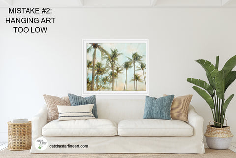
MISTAKE #2 - HANGING ART TOO LOW
People don't seem to be as likely to make this mistake, but it does still happen. At barely 5'3", I have to watch myself with this one, because my shorter stature makes it 'seem' like things should be lower so that *I* can see them easier :D.
QUICK TIP: A good guideline is that the bottom of your art should not sit on the top of your sofa. Your head extends above the sofa back when you're sitting on it. Your art should be high enough that you don't hit your head on it. The bottom of your art should be approximately 5"-9" above the back of your sofa.
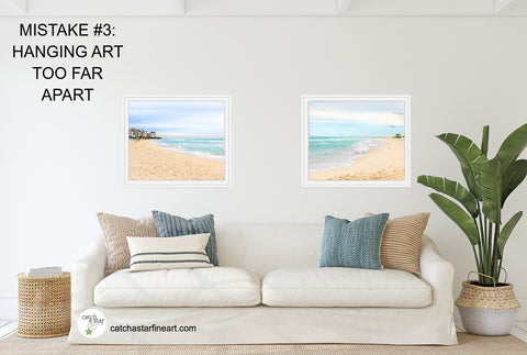
MISTAKE #3 - HANGING PIECES TOO FAR APART
Whether it's portraits, paintings, or decorative items, if you're hanging a group of items, they should be just that ... a group. They are meant to work together as a unit. That means you don't want a foot or more of space in between each piece!
QUICK TIP: A good rule of thumb is that spacing between items should be about 2"-3". If arranging them that closely means they seem too small for the space then.... you may need bigger art for that area.
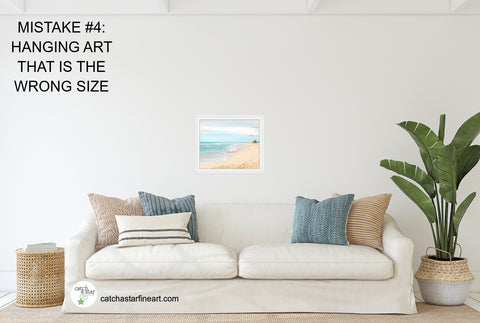
MISTAKE #4 - HANGING ART THAT IS THE WRONG SIZE
I've seen it countless times in my portrait business.... someone orders a 'big 8x10 for the wall' not even considering that an 8x10 is smaller than a piece of paper! If that 8x10 is going on the wall over a sofa, you're going to need a big collection of them.
QUICK TIP: Generally, when hanging images over a sofa or chair or other piece of furniture, the art should cover approximately 2/3 of the width of the furniture. Average sofa width is 80", so plan on art approximately 60" wide - and that can be one piece, or the overall size of the grouping.
You can 'create' the right size art for your display space in several ways .... one large piece, several medium pieces, or an assortment of small pieces working together.
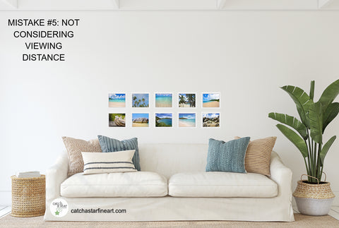
MISTAKE #5 - NOT TAKING VIEWING DISTANCE INTO ACCOUNT
If you think about looking at a magazine, you hold it at arms length or closer to see those images, right? The same holds true for small prints, up to about 8x10. That's why they're such a good choice for a hallway, or a tabletop display.
In that hallway you're about 3 feet away while you walk by, and can easily and clearly view the images. You walk right up to that table or desk, and can view those smaller prints comfortably.
You'd have to stand ON the couch to see the faces of people in an 8x10 clearly.
QUICK TIP: You're going to get a lot more impact from a few larger prints over a big piece of furniture. Your usual viewing distance for prints hanging on a wall behind a couch is going to be 6 feet + .... you see the images as you walk into the room, as you walk up to the couch, and by the time you're about 4 feet away you're turning around to set your bum on the furniture.
MISTAKE #6 - TOO MUCH VISUAL CLUTTER
I know, if you've never purchased large artwork before it can be scary. You see those dimensions listed at 30" x 40" and your heart beats a little faster... it sounds huge!
I'm a big fan of collections of prints... my hallway is all 8x10s and 5x7s of favorite images and there are about 50 prints in my average sized hallway! But it works in that space. If those same images were above my sofa, it would make that room feel visually cluttered.
QUICK TIP: Keep in mind that one (or several) large pieces tend to be visually soothing and can really anchor a room while keeping visual distractions to a minimum.

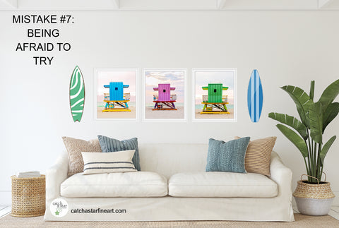
MISTAKE #7 - BEING AFRAID TO TRY
Don't be afraid to play with arrangements of images if you're just not sure what you like or what you want on a particular wall. It's just a couple tiny holes in the wall if you don't like it!
QUICK TIP: One way you can 'try' out an arrangement or placement of art pieces, or determine what size would be best for your space, is to cut out pieces of kraft paper or newspaper into the size of your art, and lightly tape it up on the wall. This will give you a visual of what that size art will look like in YOUR space.
Or - make some space on the floor and lay out your art. Move it around until you like how it looks, then move it up to the wall!
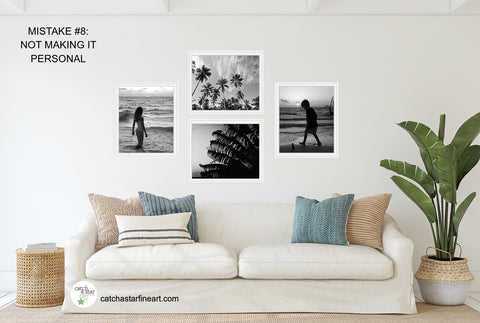
MISTAKE #8 - NOT MAKING IT PERSONAL
Man, do I love Hobby Lobby. And Kirklands. And Home Goods. I can always walk into those stores and find something that would look great in my house. That includes stuff for my walls! I'm particularly attracted to items that combine wood and metal. And I HAVE those items in my home. But so do a lot of other people.
Our home is ours. I feel like it shouldn't look like everyone elses house.
And one big way I personalize our house is with what's on the walls.
One wall in our TV room holds a really cool teak gate (found at an architectural salvage shop) that is a couple hundred years old and from halfway around the globe. In our family room there are illustrations created by artists I found on Etsy that I framed together because they fit our lifestyle. On several walls are large framed portraits of our family, some I took and some by other amazing portrait photographers we've hired. And on several walls you can also find my own fine art images that I sell in my shop.
QUICK TIP: I really love when I got into someone's house and they have unique decor items. It gives you such a feel for what things are important to them and what makes them happy. They choose to surround themselves with these things, so they must really value them. Make your space YOURS!
PIN IT!
Leave a comment